• News
  • Uncategorized
  • Vancouver

Get a combo ticket to save and access year-long value

I believe all designers benefit from the work RGD does to advocate for our industry and connect us all through events like DesignThinkers. It feels more critical than ever to have a governing body that sets a standard for knowledge and professionalism.

- Crystal Carter RGD

Presented by the Association of Registered Graphic Designers (RGD), the Toronto DesignThinkers conference is the largest annual event in Canada for graphic designers and related communications professionals. But the conference is just one of many initiatives organized by the RGD going on during the year. 

The Affiliate RGD Membership/DesignThinkers Combo Ticket provides the discounted “Member” rate to DesignThinkers, as well as savings on Membership in the RGD, which provides access to a range of benefits over the next 12 months. Below are some highlights.

Video Library
A special feature of RGD Membership is access to an archive of over 750 videos. These include recordings of inspiring DesignThinkers presentations going all the way back to 2011. Some of the many illustrious speakers whose talks are available include Michael Bierut (2018) Irma Boom (2014), Aaron Draplin (2021, 2018 + 2014), Karin Fong (2019 + 2013), Jessica Hische (VAN 2024, 2018 + 2011), Debbie Millman (2023 + 2014), Eddie Opara (2016), Stefan Sagmeister (2023 + 2012), Paula Scher (2023 + 2014), Erik Spiekermann (2014) and Jessica Walsh (2014).

Ongoing professional development
In addition to DesignThinkers, the RGD hosts over 40 hour-long webinars a year featuring live speakers offering practical information on topics ranging from UX to accessibility to the challenges of working in-house. RGD Members access all these live sessions free, as well as receiving guest passes to share with colleagues and friends.

Community
RGD Members can network and make connections with other designers throughout the year. In our Slack Community, professional Members can ask questions, access information and share thoughts on the issues impacting our industry. Virtual Communities connect Members who are working in similar disciplines or with similar clients and/or with similar backgrounds. Members also receive discounts on a variety of in-person events that take place across Canada throughout the year.

Profile
The RGD website is a hub for the Canadian design industry and Members are encouraged to post information about themselves and their work to the online Directory as well as contribute articles and other resources that are shared through the RGD’s e-newsletter, with over 25K subscribers. Members also receive discounts to enter RGD competitions, including our 2025 Branding Awards, the winners of which will be featured at next year’s DesignThinkers Conference

Giving back
Not only does RGD Membership provide tangible benefits as outlined above, it also supports a range of valuable resources and initiatives that contribute to a stronger, more informed and more equitable design industry. As a non-profit organization, the RGD invests all of our revenue, including Member dues, into our programming, particularly free resources like the Creative Earners survey, Accessible Design Guidelines and programs for emerging designers such as our Student Awards, Trailblazer Awards and DesignThinkers scholarships. By becoming a Member, you’ll be supporting all of this work as well as receive opportunities to contribute your time and expertise with invitations to judge our annual Student Awards, review student portfolios and act as a Mentor.

  • News
  • Vancouver

What’s a Creative Archetype? Dominic Prevost shares why you should know yours

Dominic Prevost is an award-winning creative director and design educator. In advance of his workshop at DesignThinkers Vancouver, we spoke to him about Creative Archetypes, how he came up with the concept and why it’s so valuable for you to know yours in today’s ever-evolving design industry.

What’s a Creative Archetype?

With the democratization of our tools, the rise of AI and the fact that all the inspiration we’ll ever need is never more than a couple clicks away, I believe that the best way to level up our creativity is to look inward first. Creative Archetypes are my attempt to help define and organize the way in which all of us tap into our creativity.

The concept behind this workshop has been on my mind for years. Over the last six months, I created an entire methodology from scratch, beta tested it with colleagues, friends and students. I’m super excited to unveil it at DesignThinkers.

How many Creative Archetypes are there?

Sixteen actually! All of them are unique but—without revealing too much—I’ve split them into four categories that share distinct traits: The Navigators, The Dreamers, The Wildcards and The Wise. If you want to know more, you’ll have to attend the workshop. That’s all I’m willing to tell!

What’s with the illustrations?

I’ve illustrated each Archetype based on their core traits. I won’t tell you their names, but some are round, others are boxy, spiky, layered, squishy… Whatever their shape, they’re all meant to illustrate the core principle behind each archetype. I had a lot of fun bringing them to life.

What can attendees expect during the workshop?

Growing up, I’d sneak into my older cousin’s bedrooms, past the scary Jim Morrison “Jesus pose” poster (you know the one) to steal their Filles D’Aujourd’hui magazines (think Quebec’s French version of Seventeen) to take the quizzes. Who wouldn’t want scientific, empirical, impartial answers to fundamental life altering questions like “Are you weirder than Avril Lavigne?” (Yes, I was scarier than Scary Spice), “What’s your dream date with Jonathan Taylor Thomas?” (Rollerblading), “Which Buffy character is your style icon?” (Spike, obviously). I want my workshop to capture that tingling feeling you get by filling up a quiz and comparing your result with your friends.

However, what I promise is actual value that each attendee will be able to apply. Because let’s face it, as trustworthy as Seventeen is, I’m not sure if I’ll ever get to have cheese fondue with Titanic-era Leonardo DiCaprio to see if we’re actually “a match made in heaven.”

By the end of the workshop, you’ll get a pretty interesting portrait of your creative personality, your strengths, areas of growth and your inspiration drivers to help you chart a part forward in your creative journey. I could go on forever, but to answer your question, the workshop will be one part personality test, and one part vision quest. If you’ve attended my previous talks or workshops, you know I’ll make every minute we have together count!

Why should we all know our Creative Archetype?

We so rarely take the time to think about how we think. The creative process is not one size fits all, and there are many different ways to harness our creativity. By unlocking your Creative Archetype, you’ll get to know yourself a bit better and (if my calculations are correct) gain a deeper understanding of what gets your creativity flowing.


Join Dominic’s workshop on finding your Creative Archetype on May 28 at 1:00 p.m. Spots are limited. Workshops are $20.

  • News
  • Vancouver

Paloma Rincón on honing your own style and creative process

Born in Mexico and based in Madrid, Paloma Rincón is a visual artist working across multiple disciplines. In advance of her talk at DesignThinkers Vancouver, we asked her a few questions about her creative process, how she found her distinct artistic style and how she makes time for fun projects.

Your style as a visual artist is so distinct: it’s vibrant and colourful, graphic and emphasizes juxtaposition. Have you always known your style, or has it been a journey of self-discovery?

I’ve been working in a similar style for years now, although it’s something I’ve developed over time. Even though it’s well-defined now, there’s always room for exploration and growth. You can always incorporate new techniques or mediums, and the stylistic aspect can also evolve.

To arrive at a particular style, and even a preferred subject or genre to work with, you should try many things. You can always learn and refine your personal vision once you’ve encountered different challenges and discovered your own point of view or approach to them

When you receive a brief, what are your next steps? Walk us through how you conceptualize your projects. 

My initial reaction upon receiving a brief is a barrage of disjointed ideas, excitement, and a hint of anxiety. These feelings stem from confronting a new challenge and something unknown. During this phase, I attempt to write down everything that comes to my mind in a brainstorming session, preferably by hand in a notebook, allowing for some rough sketching.

This early stage often requires a bit of time away, during which I focus on another task. This break is actually very valuable to me because unconsciously, my brain continues to work on it, and when I get back, things start to fall into place much more clearly.

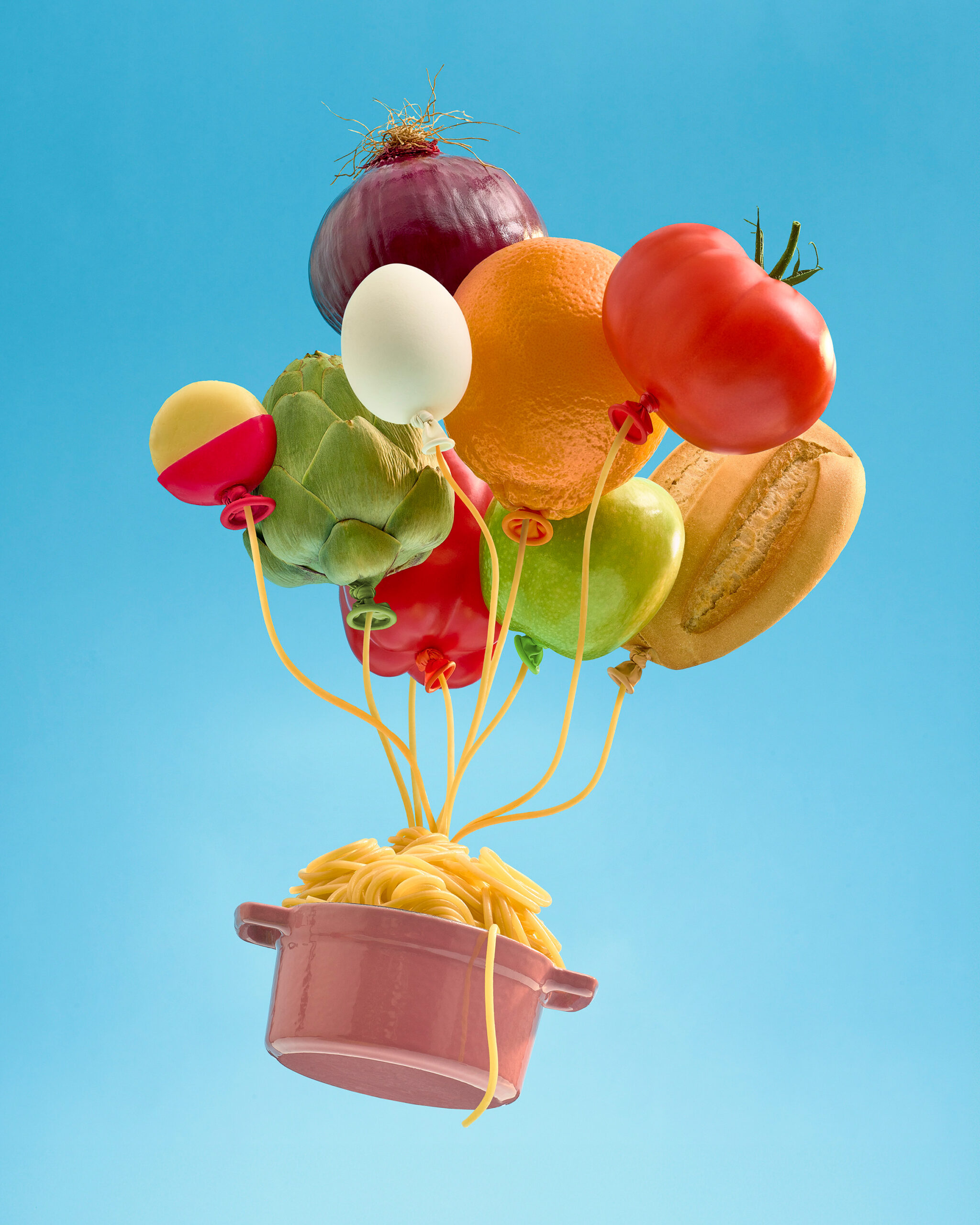
From there, comes the phase of refining, which can only be achieved by entering the preproduction phase. In my case, this involves assigning real elements and considering how to bring it to life: the set, the lighting, the camera. In this final phase, the idea is fully adapted to the physical world.

How do you balance personal endeavours with client work? Do you have any rules that you follow or routines in place? 

I don’t have any rules or routines, and it’s more a matter of the time I have available. When I’m immersed in the initial phase of a commercial project, I usually don’t have much time to dedicate to personal work. I utilize the intervals between submissions and feedback to organize and plan ahead. Additionally, the post-production phase in advertising, involving revisions and corrections, occasionally provides me with pockets of time. However, it’s during the interim periods between projects that I find myself most energized and focused on self initiated work.

Transitioning from projects characterized by external oversight to ones offering greater creative freedom is immensely gratifying. Yet, after immersing myself in self-directed work for a while, I appreciate the structured environment and collaborative dynamics of the commercial world. I believe that both contribute to my personal and professional growth.

Your DesignThinkers talk is titled, “The Creative Process as a Self-Learning Tool.” Without giving too much away, what can attendees expect from your session?

In my talk, I will share some of my work, background and process.  Through it, I will include many reflections I’ve learned over the years about the creative process; how I approach it now, what has changed through the years and what I have learned in the way. It has taught me many things, both, about the creative process itself and also about myself. It is a great tool for self-awareness.

I believe it’s crucial to understand why we do the work we do, the areas we enjoy the most, those we dislike, and why. Ultimately, it’s about learning how to navigate it all with a positive attitude

What are you most looking forward to about coming to DesignThinkers in Vancouver?

I’m excited about visiting Vancouver for the first time in my life, to be inspired by such a fantastic lineup of artists, some of whom I can call friends, and to meet with them and everyone at the conference. I’ve had the pleasure of speaking at Design Thinkers Toronto in the past, and I can’t wait to have a similarly wonderful experience again.


Catch Paloma’s talk, The Creative Process as a Self-Learning Tool, at 3:00 p.m. on May 28.

  • News
  • Vancouver

Introducing the DesignThinkers Podcast

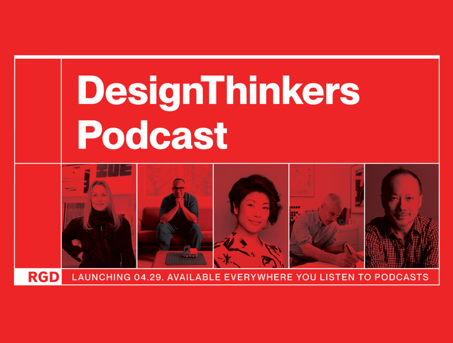
To celebrate 25 years of DesignThinkers, the RGD is launching a podcast where we dig into the archives and reconnect with 25 past speakers about the talks and ideas that have shaped their careers, and our event.

Hosted by RGD President, Nicola Hamilton with branding, editing and coordination by Ashley Tomlinson Provisional RGD, the first episode featuring Paula Scher will premiere on April 29.

Featuring conversations with some of the biggest names to grace the DesignThinkers stage, in the podcast, they reflect on their careers and experiences at DesignThinkers in the recent and not-so recent past. Also included are audio clips of past talks.

“The list is amazing! All credit there goes to our Executive Director, Hilary Ashworth, who really outdid herself on the guest list. We’ve already spoken with Paula Scher, Lauren Hom, Annie Atkins, Brian Collins, Sagi Haviv, Ellen Lupton, Aaron Draplin, Forest Young, Erin Sarofsky, Michael Beirut, Steven Heller, Chip Kidd and Debbie Millman,” offers Nicola.

“Neither of us have been attending DesignThinkers from the beginning, so having an excuse to dig into the video archive was a treat. It’s a treasure trove of knowledge. We also really enjoyed speaking with past DesignThinkers Brand Partners for our bonus episodes. We’ve learned a lot about the history of the conference,” says Ashley. “We, as RGD Members and Canadian designers, are lucky to call this conference ours.”

“The long-standing relationships that the RGD has built with so many prominent designers on a global scale is really special. We had many speakers chat about how much they enjoy speaking at the conference. The RGD team works so hard to ensure that both attendees and speakers have an enjoyable experience,” adds Nicola.

A new episode releases every Monday starting April 29 with bonus episodes, featuring our past Brand Partners including Vanessa Eckstein RGD (blok design), Hans Thiessen RGD (Rethink) and Howard Poon RGD (DDB Canada), released on Wednesdays.

Subscribe to the DesignThinkers Podcast on all podcast apps, including on Apple and Spotify.

  • News
  • Vancouver

Talking project fails and the power of personality with SNASK

SNASK is a creative agency of misfit geniuses based in Stockholm, Sweden. In advance of their talk at DesignThinkers Vancouver, we asked SNASK execs Freddie Öst and Erik Kockum a few questions about agency branding, how to cope when projects don’t go to plan and more.

The SNASK brand is fun. It’s clear you endeavour to do things differently — with humour, with personality, with passion, and that ethos is evident in the projects you’ve worked on. How important is a studio’s own brand for attracting the kind of clients they want to work with?

This is a very good question. With our own brand, we never created it to fit or attract a certain type of client or audience. We simply made it the way we felt it resonated with ourselves as individuals. We were our own target group for the brand, because our purpose of having a company and agency was to build a vehicle to have fun, rather than a profit-making company. So everything that Snask is as a brand is what we ourselves would love from a similar brand.

Now, for the question, we strongly believe that an agency’s brand is very important, and of course attracting clients is, not the only, but certainly one of its major purposes. In the end, a human being is going to receive a message sent by another human being. So naturally we’re delighted when a human being at a company loves our values. We believe that more agencies should care more about their own brand and making it interesting. Most only care about the looks, trying to come across as minimalistic and professional, while most humans are attracted to an interesting personality with values, as well as a charming tone of voice. Who would marry someone for looks? It’s the way they make you laugh, cry and feel that are their most important aspects. Why not do everything in your power to make your future clients smile when they visit your website, social media etc.

Many design professionals work within constraints, whether it be small budgets, decision makers who don’t “get it” or ineffective work flows, especially in-house. Do you have any advice or insight for these designers who may be wanting to shake things up or push the envelope within this kind of environment?

We specialize in these matters, pushing through change in organizations from board level and all the way down to design and marketing teams. Things start at the top and trickle down, so if change is needed, and it is, you need to somehow get the top management involved. We often come in through a marketing director, but very quickly end up with the C-levels to help sell the purpose of change and turning a rebrand cost into an investment.

If you’re a designer working in-house and you need change, you should start voicing your opinion on this matter and speak in terms of the future costs of not changing in time. Management most often doesn’t understand the value of design or marketing, but they do understand the words cost, risk and also investment. It’s like being in a romantic relationship and seeing therapy as a cost. One needs to educate and convince the other partner that it’s actually an investment, and that the alternative of not going to therapy most likely will end in catastrophe.

SNASK’s project roster boasts some seriously creative, colourful and ambitious work. This is, of course, what we see on the outside, and as designers, we know there are often lots of ideas that never see the light of day. Can you tell us about a project that didn’t go to plan, “failed” or that you struggled with? How did you cope?

A lot of projects don’t go according to our vision. When this happens, we are open and transparent with the client and let them know that if we take this route, we will not case the project, meaning we won’t think it will be great enough to showcase on our website. However, we let them know that we can still make it look good, but for our portfolio standards, it won’t hold up. Sometimes they change their mind and go with our recommendations, sometimes they don’t. So we do have big projects that no one has ever seen, and that’s ok. They weren’t a catastrophe, but why show something that you’re not proud of. After all, what you have in your portfolio is what future clients will want you to do again. So if you put just “good enough” projects in your portfolio, clients will ask you to do just that.

As for a project that didn’t go as planned, we rebranded a huge financial player. It was a solid process all the way through until the founder and CEO stepped in. He had given the mandate to the marketing team to make brand decisions, and yet here he was wanting to have opinions on the new logo. The feedback was terrible, he couldn’t tell us what he didn’t like with the new logo, and he couldn’t tell us what he liked in other logos. It turned out that he had sent the new logo to his 12 closest members of staff. Who were they? 12 white men, within similar age, all having big salaries that depended on him liking them. So naturally, all of them told him they agreed that they didn’t like it. Since none of them had worked within design or brand strategy, they weren’t experts in these fields, and of course couldn’t back up their thoughts with rational arguments. In the end, all the work we had done was thrown out the door and the old logo was used instead.

A similar thing happened with another client, where the management team was asked about the company’s new symbol. None of them had expertise in this, and yet they were asked, so they had to give an opinion. Naturally, the feedback was horrendous. One of them said that the old symbol that was a cloud, was modern and shouldn’t change because their service was digital after all, and “in the cloud.” What he failed to understand was that services “in the cloud” is not even a thing, it’s expected and it’s probably the opposite. Companies that showcase that they are “in the cloud” are probably not that modern. In the end, we had to step in and have a long conversation with them where everyone could have an opinion, but had to be able to back it up with argumentation. After a few hours, we were back on track and could continue implementing the new visual identity with the new symbol. How we coped? We went to therapy.

Your DesignThinkers talk is titled, “F*ck the Conservative World!” Without giving too much away, what can attendees expect from your session?

It will be the opposite of conservative, so they will hear and see examples of being progressive, modern and open-minded. The thought of “let’s keep things the way they’ve always been” is absurd from the get-go. At what given time should we conserve things? Christmas 1995 when Dean Martin died? April 1960 just before the contraceptive pill was launched? It’s impossible to say a date when “things were better.” The world has changed, and we need to move on and concentrate on now and the future. And we’re now living in such a fast moving world that we need to embrace change and make sure it moves in the right direction. Focusing on what already happened won’t create change, it’s memories. So if we want to embrace change, we need to look forward, as it’s the only thing we actually can change.

People will also hear stupid things, wish they had a glass of red in their hand and will most probably need a smoke straight afterwards.

What are you most looking forward to about coming to DesignThinkers in Vancouver?

Wow, what don’t we look forward to! We’ve heard so many great things about Vancouver, so it’s hard to pick. First of all, being part of this great conference and hanging out with the audience. Then of course meeting with fellow speakers, many of them are dear friends to us. As for Vancouver, we will stay longer than the conference and explore your wild hiking trails. We won’t go on the “Fifty Shades of Grey-locations with wine tour” that we got recommended on Airbnb. Do crazy stuff like throwing snowballs, find a dealer of yellow margarine and share a pint with a sasquatch.


Catch SNASK’s talk, F*ck the Conservative World!, at 5:00 p.m. on May 28.

  • News
  • Vancouver

Design Educators Conference is May 30 in Vancouver

The Design Educators Conference is back in Vancouver on Thursday, May 30, following DesignThinkers Vancouver. Educators from around the world are invited to attend to discuss the future of design education.

Registration is open.

Organized in collaboration with the Vancouver Community College, the 2024 conference theme is Compassion, Creativity and Community.

Presenters include Dori Tunstall, Founder and Lead Executive Director at Dori Tunstall Inc. and Ellen Lupton, Designer, Writer and Educator.

Submit a proposal to speak at the event. The deadline to submit is February 26.


If you have questions, email RGD’s Programs Manager, Abdul Omar at [email protected].

  • News
  • Scholarships
  • Vancouver

Attend DesignThinkers Vancouver for free

Student RGDs, Provisional RGDs and Junior Affiliates are invited to apply to win free attendance to DesignThinkers Vancouver. 10 scholarship packages are available, each including a free ticket and $500 cash to help cover the costs to attend.

To apply, submit a 30-second to 1-minute video expressing your enthusiasm for DesignThinkers Vancouver and why you want to attend.

Assessment

Applicants will be assessed on their creativity and passion. Priority will be given to Members who reside 100 km or more away from the location of the conference.

You must be a current Student RGD, Provisional RGD or Junior Affiliate Member to be eligible.

Deadline

11:59 pm PST on Monday, April 8, 2024

Thank you

These scholarships are generously provided by 123wBecoming Design OfficeOK DAVEPendoPSDDB (digital), Pound & GrainResonanceRethinkRoodenburg Design and Will.

Interested in supporting young designers? If you are interested in sponsoring a scholarship, email [email protected].

  • News
  • Toronto
  • Vancouver

Whitman Emorson signs on as Design Partner for 2024

Joining the roster of esteemed firms who have developed branding for the DesignThinkers conferences, Whitman Emorson shares their design process, challenges, inspiration and more for the 2024 branding.

In its 25th year, the 2024 Conferences take place in-person with an option for online streaming in Vancouver on May 28-29 (registration opens Dec 2023) and in Toronto on Nov 7-8 (registration opens May 2024).

Why did you and your team want to take on the 2024 DesignThinkers branding as a project?
We took on the 2024 DesignThinkers branding project because of its significant impact on both the Canadian design community and our personal growth as individuals over the years. We are so lucky to have access to this kind of event so close to home and seeing all the studios who have contributed in the past is inspiring. Creating the conference identity also allows folks to get to know us at Whitman Emorson, our exceptionally talented team, our design philosophy and, of course, engage with the identity we’ve created! Plus, what a cool brief. It’s been freeing to step out of the parameters of our day-to-day and shake up our process to establish the visual identity for 2024.

What has been the most challenging aspect of coming up with the design/concept?
The most challenging part of this project/process has also been the most exciting! It’s a fairly open brief with fewer parameters than we’re used to (in this industry). Instinctually, as designers, we often thrive with structure, guardrails and restrictions. “Freedom within a framework” allows for play while being tethered — to explore, but not too far, to play, but within the sandbox. With the brief for 2024 DesignThinkers, we were challenged by the freedom of possibility and the endless ideas that come with it. Allowing ourselves to lean into a feeling of “anything is possible” was equally challenging as it was exciting.

We were also challenged knowing this visual identity would be viewed by our peers, both locally and internationally. Its reach and scale inspired us to create something that would resonate with the design community and the broader creative community, leading us to question: What is universally true? What will inspire and excite? What will be differentiated and how can we push our ideas/thinking/execution, all while having fun?

What is the source of inspiration for the concept? What research did you undertake?
Our source of inspiration for the concept stemmed from something that felt relevant to the design industry at large — the notion that embarking on any creative project can be initially daunting and overwhelming, often with uncertainty about where to begin, but ultimately, it is a fruitful and fulfilling journey.

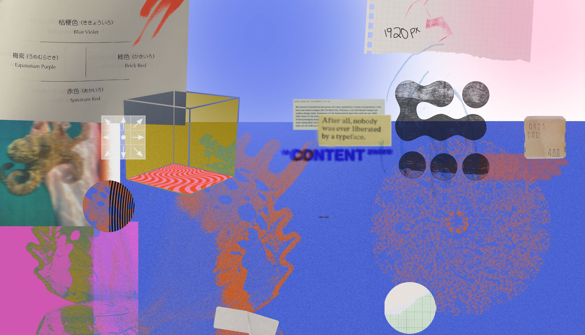
Drawing from a range of influences, including surrealism, collages, graphic design tools and devices such as optical illusions, animation and textured layers, we were inspired by being immersed in the creative process ourselves. Our approach involved extensive visual research, employing tools like brainstorms, mind maps and mood boards. Ultimately, we aimed for the concept to capture and celebrate the dreamlike, unpredictable nature of the creative process, inviting attendees to enter into a world of endless discovery.

What has been your team’s design process to tackle this project?
We used this brief as an opportunity to shake things up and explore a new approach — nothing revolutionary but definitely different from our day-to-day. We briefed everyone on our team, including accounts, strategy and interns and conducted a studio-wide brainstorm. The session was inclusive and varied, yielding a wide range of themes and ideas! Designers were then paired up in teams, where each was responsible for coming up with creative directions and visual executions centred on a core idea or theme. We did quite a bit of research and narrowed in on three directions, two of which were shared with the RGD Design Committee. We were closely involved in the decision-making process and ultimately decided on, in our very humble opinion, an identity that we believe (and hope!) will resonate with attendees and speakers alike.

To learn more about sponsoring DesignThinkers, email Michelle Pereira Hampton, RGD’s Director of Communications & Development, at [email protected].

If you would like to submit a proposal to speak at the event, apply here.

General conference inquiries can be sent to Abdul Omar, RGD’s Programs Manager, at [email protected].

  • News
  • Vancouver

Over 600 creatives come together in Vancouver

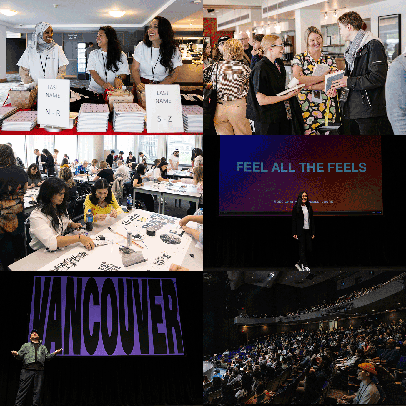
The attendees learned something new about themselves at the workshops, took inspiration from the stories of the speakers and indulged in some retail therapy at the designer marketplace — there was something for everyone on May 30–31 at the 24th annual DesignThinkers Conference in Vancouver. See conference highlights below.

The conference featured talks by Eleni BeveratouTheresa FitzgeraldDebbie MillmanPum LefebureLiza EnebeisCey AdamsAlex CenterThas Naseemuddeen and workshops by Laurie RosenwaldDominic Ayre RGDDominic PrevostTom FroeseDiana Varma RGD and Mustaali Raj.

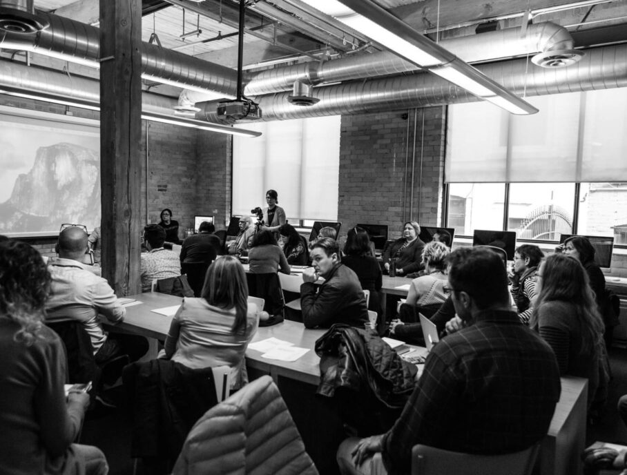
Over the two days, attendees participated in roundtable discussions, a campus tour, book signings, sampled offerings from industry suppliers and artisans. Everyone also had an opportunity to engage with each other at a delegate party.

Below we share some takeaways from the presentations: 

“If you get an opportunity to work with someone you love and to do things you love, appreciate it in that moment. I say this because we’re all creatives — we’re difficult to deal with sometimes, we deal with people who are difficult to deal with sometimes — so to all the young ones, be in the moment. Because there is no such thing as the future. Now is the future. Enjoy it.” — Cey Adams, Visual Artist

“We are always looking to be perfect. But for me, the word ‘perfect’ is killing because it means it is almost the end of a project. What I love the most is doubt and I work with doubt all the time. It means that you’re not settled and you want to discover more. Opening up that door is very important for design. Not perfection.” Liza Enebeis, Creative Director & Partner, Studio Dumbar/DEPT®

“We live in uncertain times and it is hard to know what matters. We do have questions about tomorrow. To me, character matters. Every day we can make choices that allow us to shift and grow our awareness, to take better care of ourselves so that we can take better care of each other, growing resilience to adapt to whatever the changes bring is really important. Character matters and it is something you do even if no one is there.” — Theresa Fitzgerald, Ex-Vice President Brand Creative, Sesame Workshop

“When we talk about accessibility [in typography] there are three things to consider. First is legibility, which how fast we recognize a ‘c’ to an ‘o’ or an ‘e’ to an ‘a’. The second is readability — the typesetting, how lengthy the paragraph is, what are the colour combinations between text and background, etc. And lastly likeability, this cannot be measured but as humans we like different things and what we like does define accessibility.” — Eleni Beveratou, Creative Director, Dalton Maag

“Strict regulations can be a designer’s best friend. As designers, we thrive when we are given boundaries and limitations, otherwise we’d be artists. I have always thought of designers as artists who solve problems.” — Matt Webb, Senior Brand Manager (Craft), BZAM Cannabis

“I always tech my team to be a keen observer of emotions. Noticing emotions makes you a better designer. Seeing is one thing, but feeling gives you much deeper connection with the audience.” — Pum Lefebure, Co-Founder & Chief Creative Officer, Design Army

“Bringing form to feeling is about creating something tangible from a set of emotions or abstract ideas. In some instances, that tangible form and visual expression has the ability to transcend conventional language to form a deeper sense of connection with the viewer.” — Tom Hingston, Creative Director & Founder, Hingston Studio

Registration for DesignThinkers Toronto on November 2–3 (in-person and streaming) is now open. 

Register now!

  • News
  • Vancouver

Catching up with our event photographer, Connie Tsang

Connie is a Vancouver-based photographer with 10+ years of experience as a full-time freelancer, specializing in events and photojournalism. Connie’s been the person behind the lens for many of our DesignThinkers conferences in Toronto. We caught up with her before she joins us for the first time in Vancouver.

What do you like most about event photography?

It keeps me on my toes, that’s for sure, so there’s rarely a dull moment. Being launched into new situations, where I can be a fly on the wall with groups of people leading me in various directions is really exciting. Most of all, I love natural interactions, and being able to step back and tell the story of a day is a really fun job.

What are your top three must-have items when you’re out on a shoot?

A lens cloth, lip balm, and a running mental map of where the closest water stations/washrooms are.

You’ve photographed DesignThinkers for a number of years (thank you!). What are you looking forward to about DesignThinkers Vancouver?

I’m so happy to be a part of the event again. This will be my first one in Vancouver, so I’m eager to experience the vibe over here! Over the years, I’ve seen some great speakers and met interesting attendees, so if it’s anything similar, I know I’ll have this to look forward to!

See more of Connie’s work on her website and Instagram.

DesignThinkers Newsletter

Sign up for conference updates, speaker news, and more from the RGD