Contributed by Dominic Ayre RGD
I do feel like a kid before Christmas as I wait for DesignThinkers. When I was growing up, one of the true joys was flipping through catalogue pages (I miss printed catalogues!) and looking through the toy section at the newest Lego or Action Force figures. I would read the beautifully crafted descriptions and dream that my aunt and uncle were secretly rolling in cash to be able to buy the whole section for my cousins and me.
Seeing the list of the DT speakers triggers the same endorphin rush as my past catalogue journeys. Over the course of 25 years, some of the biggest names in design and design culture have graced the stages in Vancouver and Toronto. The conference has shifted, as the industry has, from large portfolio presentations to talks rooted in important, current topics that are affecting us as designers, and also us as citizens.
Like with Christmas when I never got everything in the catalogue, I can’t see every speaker at DesignThinkers. Here, I have picked my favourite projects from the five speakers I am jumping around my room in anticipation of seeing in November.
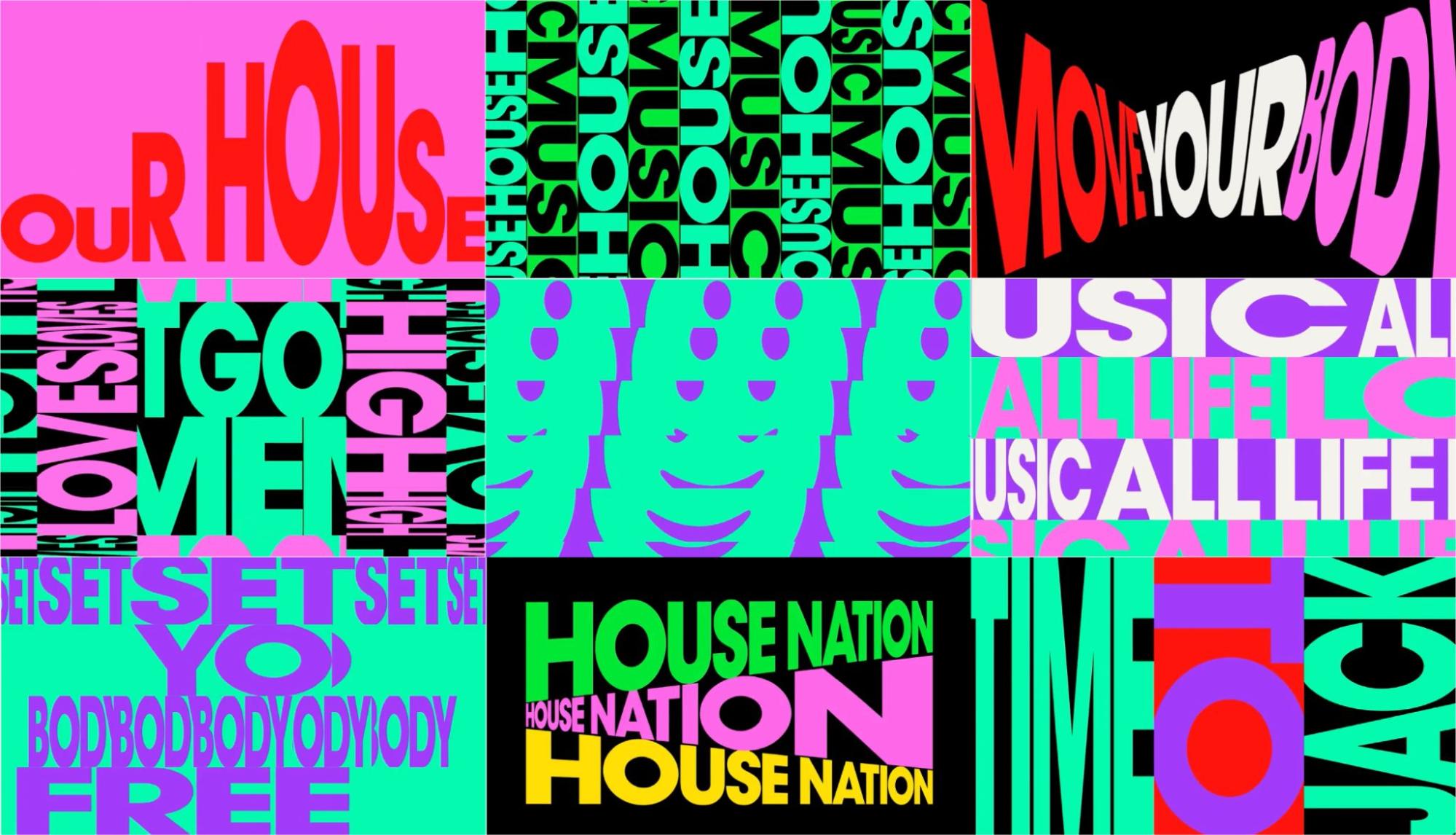
Studio Moross: Defected Records, Live Visuals Kit 2024
I am a house music fan. I have been for a long time And, if you enjoy house music, you probably know the record label, Defected. I am also a Studio Moross fan. Aries Moross and their team were asked to create a series of bold typographic background videos for Defected’s live events. I love the fact that Studio Moross created a day-and-night version of the visual toolkit and took advantage of the sheer scale of the massive video canvases—pure bliss with sound and design.
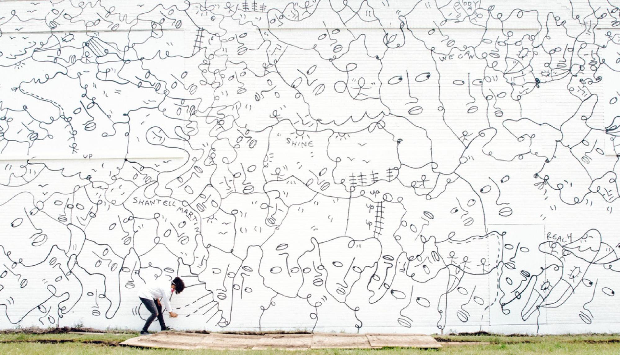
Shantell Martin: Dance Everyday + ALL OF HER WORK
Anyone who has come in contact with Shantell Martin and her work will have been inspired to draw. I was introduced to her beautiful line drawings when she collaborated with Kendrick Lamar in Miami, and I have followed her since. Though clean and simple on the surface, Shantell’s large installations often tackle broad issues. Here, I chose her mural from Buffalo, New York (2017) simply because I have seen it in real life, but her entire portfolio is inspiring. Look for the stitching collaboration with her grandmother, Dot Martin.
Elizabeth Goodspeed: Anyway Magazine
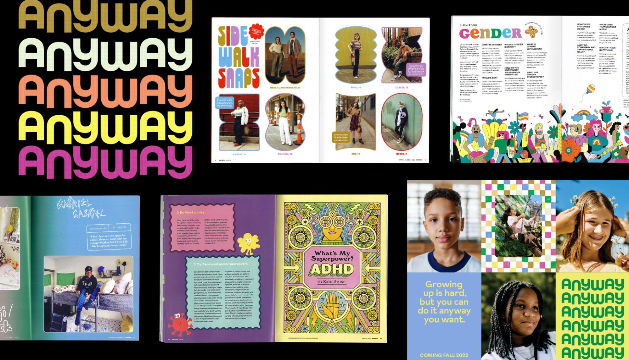
I first read Elizabeth Goodspeed’s byline as part of the team behind Eye on Design. EoD, published by the AIGA, still stands as one of the most important design platforms during its both print and digital run. I love that when I see Elizabeth’s work, I feel as though I am being allowed into a personal design celebration. Anyway is a magazine created for tweens and teens. Its articles treat kids with dignity and respect and cover topics that they confront the everyday, from family, friends, gender and identity. Elizabeth and the designers who assist here have designed a printed place of comfort and inclusion that happens to also be super bright and joyous with moments of whimsy. RUNNER UP: Also, check out Elizabeth’s involvement with Pentagram in the fictional Minx magazine created for the HBO Max/Starz series.
Talia Cotton: Counter-Archiving the Avant Garde
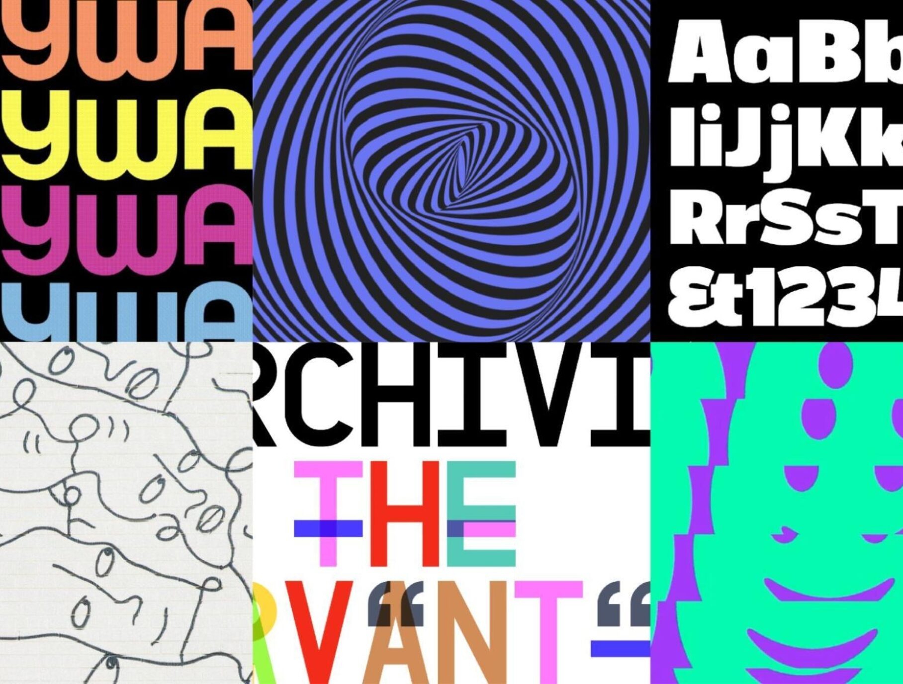
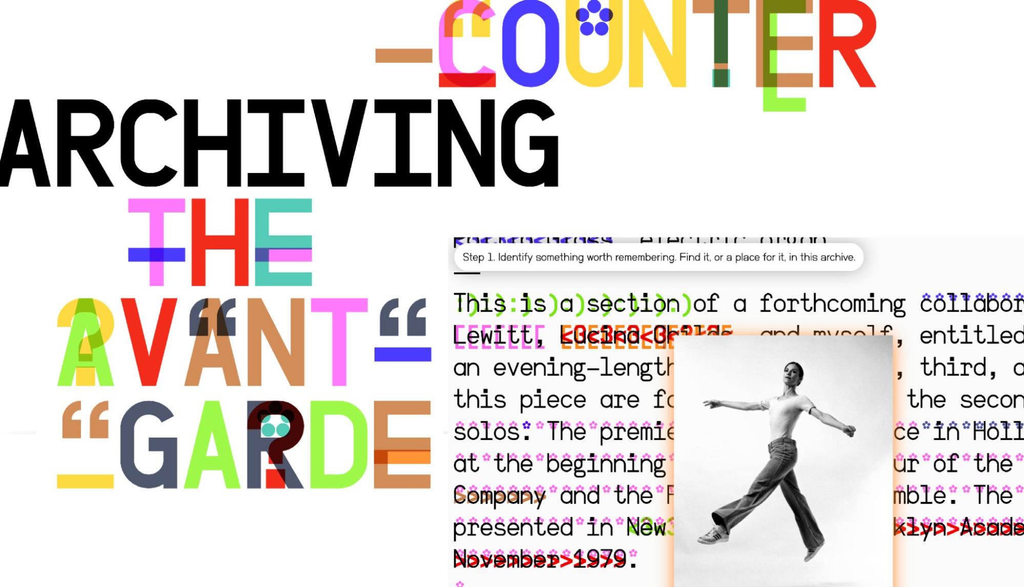
When you watch movies that use a lot of visual effects, you can tell the difference in quality. Designers can sometimes make technology stick out like a sore thumb, while other designers integrate it seamlessly. Talia Cotton certainly is the latter. In Talia’s practice, she uses technology like a paintbrush. The great thing about her projects is that, even though they are rooted in complex digital frameworks, they feel intuitive, vibrant and alive. I was particularly moved by her project, COUNTER-ARCHIVING THE AVANT-GARDE. This site challenges the idea of a static, closed archive, hence Counter-Archive, by encouraging written discourse to grow and thrive in the platform around the subject of the Global South’s influence on American avant-garde music.
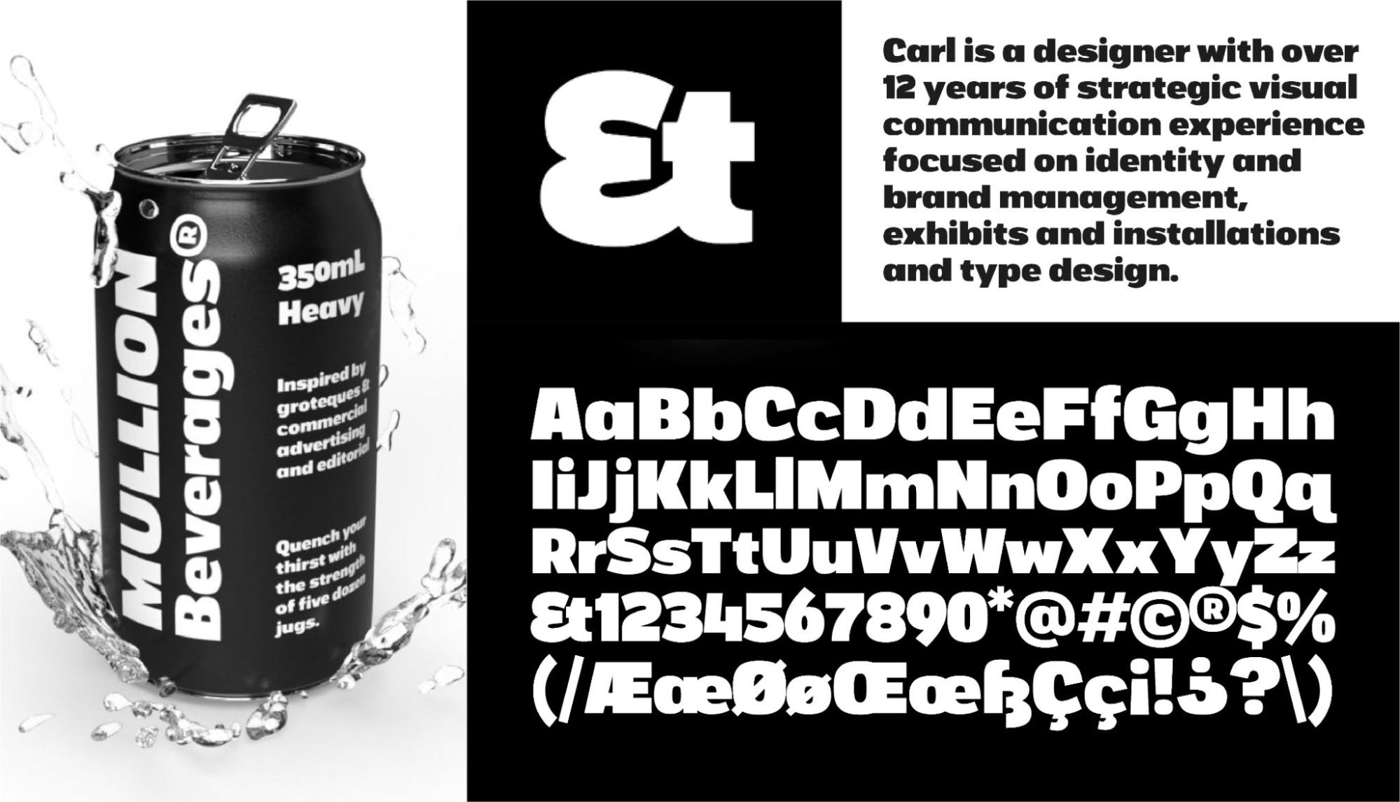
Department of Letters: Mullion Heavy Typeface
Department of Letters is a Toronto-based type foundry that was launched this year by Carl Shura. All cards on the table: I am a faculty member with Carl at the School of Design at Toronto’s George Brown College. He is one of the nicest people you’ll meet. In 2022, Carl won a CA Award of Excellence for his typeface Circulation, and I was super-excited to see the launch of Mullion (Heavy), a chunky grotesque that has some fun eccentricities. Carl is hosting a Type Design Crash Course at DesignThinkers, which will be a lot of fun.